Are you seeking to build a responsive grid without calculating breakpoints and having to write multiple lines of code? Well you’ve found the right blog! This is a tutorial on how to properly apply CSS Grid Layout across all browsers. There’s plenty of code examples along the way to hopefully empower you to have confidence in building out your own grid!
Remember the good ol’ days when Flexbox came out! Everyone was so excited that they didn’t need to use floats, positioning or inline displays anymore. Well almost the same excitement if not even more joy was expressed when CSS Grid Layout came out. Unlike Flexbox, which was only a 1-dimensional layout model, CSS Grid is a 2-dimensional model that can make both rows and columns dynamic and responsive. Even better, there is no library necessary to apply this amazing grid layout.
CSS Grid is one of the most powerful layout tools, but unfortunately it isn’t fully supported with older browser versions or IE11. Users should be cautious and aware of this partial support. Of course we would like to shun IE users and not account for them, but we need to make sure our layouts appear nicely for all users. Since Flexbox has more support than CSS Grid in most of the older browser versions we can apply a Flexbox layout as a fallback if CSS Grid isn’t supported.
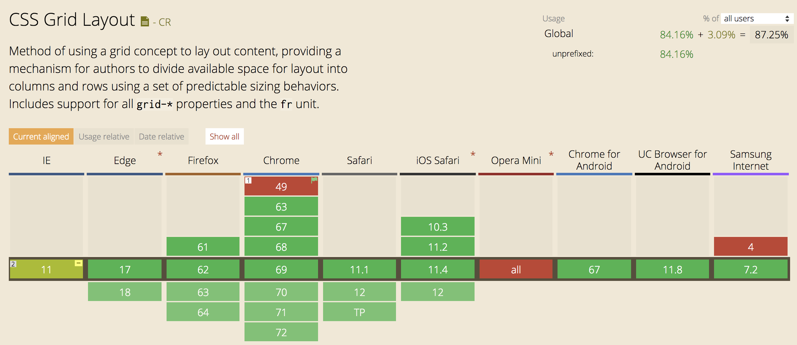
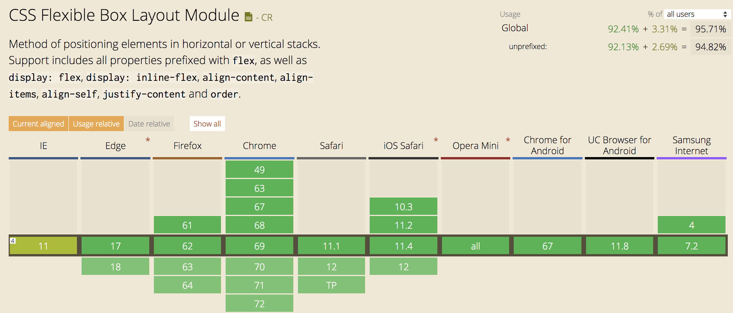
After multiple attempts and wonky grids I was finally able to come up with a grid system that used CSS Grid with a Flexbox fallback that looked consistent in all browsers. In order to accomplish this feat, I needed ways to check which browser I was using. A handy feature query in CSS to check in a browser if a CSS property is supported is @supports. This query checks the browser support and will then apply the CSS properties within the block statement. Slack’s redesign of their website was a great example of this feature query.
@supports (display: grid) {
  display: grid;
}
However, since @supports is not supported in IE11 I needed to find an additional way to identify which browser I was using. (NOTE: @supports not (display: grid) does not work in IE11). We can use a JavaScript function to detect if IE11 is the current browser. navigator.userAgent returns a string of the current browser, so this function was triggered on page load and would then add the class ie11 to the body html tag. Now with this class available to me I could style IE11 with the Flexbox fallback.
function detectIE() {
  if(navigator.userAgent.match(/Trident.*rv:11\./)) {
    $('body').addClass('ie11');
  }
}
.ie11 {
  // CSS styling for Flexbox fallback
}
(Trident is used to help detect Microsoft Windows/Internet Explorer)
Now don’t forget, we’ve checked for browser compatibility, but remember we should still add vendor prefixes when necessary. Currently, Chrome, Firefox, Safari, Opera and Edge (>15) are unprefixed. For reference, here’s a nice example of Sass mixins with -ms prefixes for CSS Grid Layouts.
CSS Grid Layout Example
Finally, onto the fun part with coding! When applying the CSS Grid to your layout you will apply the grid styling to the outer container of your elements. Make an unordered list ul with multiple list items.
.grid-container {
  @supports (display: grid) {
    display: grid;
    grid-column-gap: 30px;
    grid-row-gap: 30px;
    grid-template-columns: repeat(auto-fill, minmax(290px, 1fr));
  }
}
In the above example, the CSS Grid styling will be applied to the unordered list. The actual list items don’t need any styling since the grid-template-columns property declares the width of each list item column. Don’t be intimidated by what is stated after this property. repeat is just a way to denote that there’s repetition of the values in the parentheses, which will be applied to all the columns in the grid. Thus, each column will have auto-fill and a minmax of 290px/1fr. minmax refers to the upper and lower limit for the column width. The columns can’t be smaller than 290px and at maximum they can only fill 1fr. 1fr stands for “fraction”, so the grid will be of equal sized list items that are greater than 290px, but will take up equal fractions of the container. As for auto-fill, the list items will only take up the remaining space of equal fractions rather than stretching to fill the entire container. Still confused by the column sizing, here’s a good read for clarification. The grid-column-gap and grid-row-gap are the column and row gutters.
Below is a comparison of auto-fill versus auto-fit and how the inner elements fill up the parent container.
grid-template-columns: repeat(auto-fill, minmax(200px, 1fr));

grid-template-columns: repeat(auto-fit, minmax(200px, 1fr));

Flexbox Layout Example
Now onto familiarity with the Flexbox grid layout. On the outer container we can apply display: flex;, flex-direction: row;, and flex-warp: wrap;. By specifying wrap, the inner elements will wrap onto the next line once the container width has been exceeded. As a side note, you can’t center a Flexbox container and left-align elements inside with flex-wrap, so calculations with margin and widths are necessary. Now that we have a container with Flexbox that’s wrapping the inner elements, we need to determine a width for the inner elements by stating a min-width and a width. In my example below, I wanted 5 elements in a row stretching the full width with a minimum width of 290px less 15px of margin on both the right and left sides. The 15px represents the gutters on each side of the inner elements, so margin replaces the grid-column-row and grid-column-gap properties.
.grid-container {
  display: flex;
  flex-direction: row;
  flex-wrap: wrap;
}
li {
  margin: 15px;
  min-width: 290px;
  width: calc((100% / 5) - 30px);
}
CSS Grid Layout with Flexbox Layout Fallback Example
At last, we have arrived at the finale of combining both CSS Grid and Flexbox! 🏁 Putting it all together now, remember we want to check for our current browser in order to apply the supported CSS. We can already declare the Flexbox layout on the grid-container since the display: grid is within the @support block condition, so the Flexbox fallback will automatically be applied to IE11 and the other browsers will get the CSS Grid Layout. Then we just have to account for defining a width for the list items. This defined width will be nested under the ie11 class, which was added to the body of the html. This width will be calculated based on how many elements you desire to fill your row. Then most likely you will need to include media queries to adjust the width of the elements for different devices.
.grid-container {
  display: flex;
  flex-direction: row;
  flex-wrap: wrap;
    @supports (display: grid) {
      display: grid;
      grid-column-gap: 30px;
      grid-row-gap: 30px;
      grid-template-columns: repeat(auto-fill, minmax(290px, 1fr));
    }
  }
  .ie11 {
    li {
      margin: 15px;
      min-width: 290px;
      width: calc((100% / 5) - 30px);
    }
  }
Below is a demonstration of what a grid in IE11 would look like with and without a Flexbox fallback. As you can see, declaring flex-wrap and defining a min-width and width for the elements within the container is imperative for a grid system that utilizes Flexbox as the fallback.

—
After CSS Grid beautifully lays out your grid you can easily inspect it with your DevTools. You will know that you have successfully applied your CSS Grid when hovering over the layout because it will be outlined. This is a great way to view your gutter spaces and make any incremental adjustments. If you need to perform cross browser compatibility testing, Browserstack has been invaluable with our development.
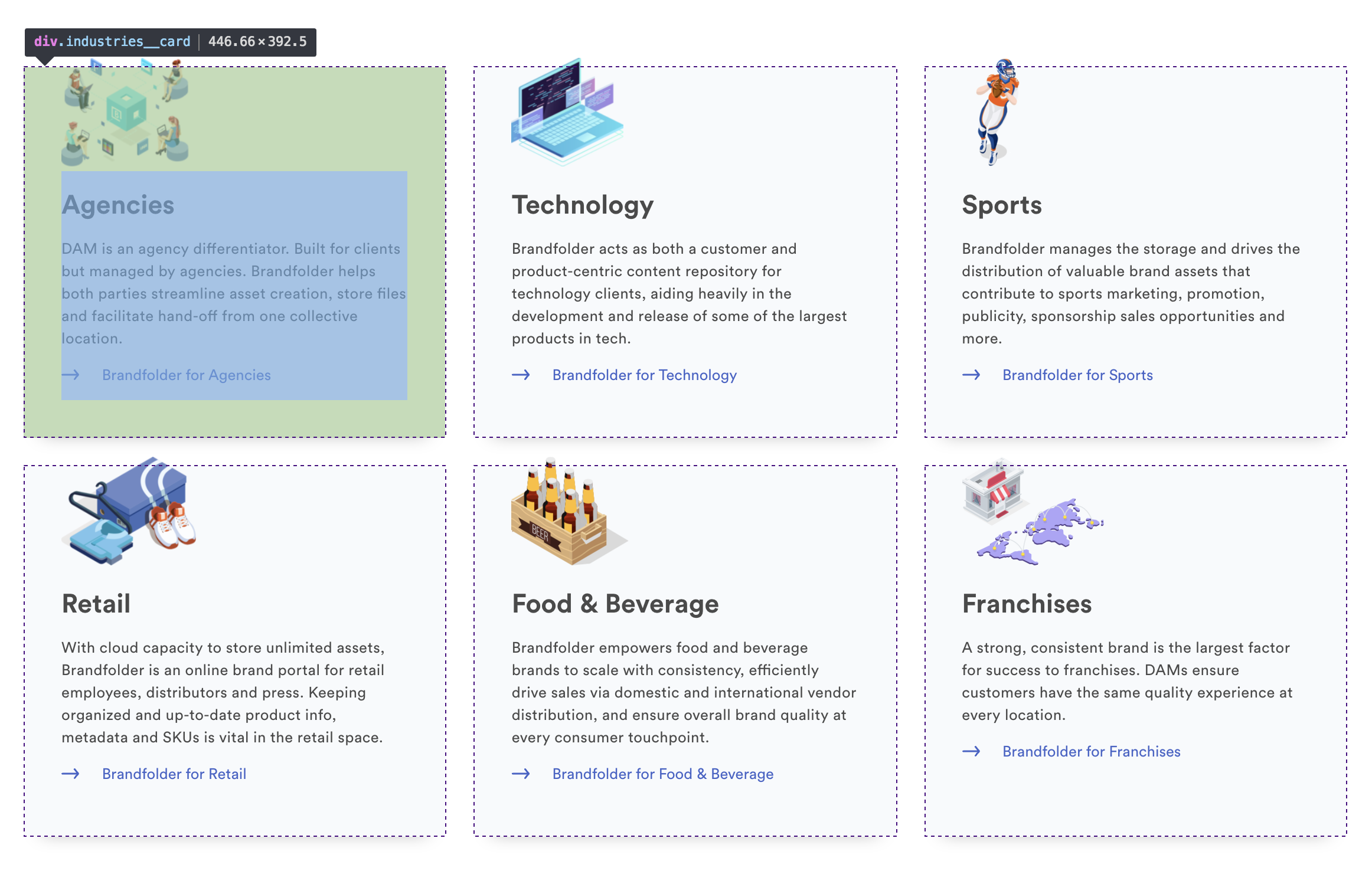
Currently, I work at Brandfolder and we recently changed our layout system of our website as well as our product to CSS Grid in order to enhance the responsiveness of our UI. By implementing CSS Grid into our website and product we were able to reduce code by not having to specify multiple breakpoints with media queries. Not to mention, once we had a Flexbox fallback for our CSS Grid, we made it reusable, so that we had a consistent grid framework. If your app is built with Ruby, we found a useful gem to help us detect browser details in even more depth as well as deciphering browser versions, platforms and devices.
—
TAKEAWAYS: CSS Grid is a powerful layout tool and can be easily implemented Need some method to check browser support Add necessary prefixes and fallbacks for browsers that don’t support CSS Grid Layout Celebrate how responsive and dynamic your new layout is 🎉
—
Have you encountered problems with CSS Grid Layout and have found alternative ways to support legacy browsers? Please share…but hopefully it will soon be supported more! 👏 if you found this helpful!

