
While building Brandfolder’s Portals, which is like a customizable homepage for all your assets, I implemented React DnD in order to allow users to update the ordering of their assets. Out of the box React DnD was fairly straightforward to use, but it took some time figuring out a solution to indicate to users where they were placing their portal tiles that were in a grid. The layout of the tiles is like the image below.

Tiles can be varying widths and can be moved vertically or horizontally in the grid. In order for users to visually see where they are dropping the tile being dragged I needed an indicator to show users the placement of where the tiles would be dropped. I will walk through the steps that I went through to get this placement horizontal indicator working.
1.You need to install React DnD
yarn add react-dnd react-dnd-html5-backend

import dragDropTypes from '@components/common/drop_zone/drag_drop_types';

import { useDrag, useDrop } from 'react-dnd';
2.I installed classnames, so that I could pass an object through as a className
yarn add classnames

import classnames from 'classnames';
3.In order to use React DnD you need a backend, but you can inject it through a window object. Since Tiles is the component I want to be able to use the drag n’ drop functionality in I need to wrap it with the DndProvider and the backend.
<DndProvider backend={Backend} key="tiles">
  <Tiles
    tiles={tiles}
  />
</DndProvider>
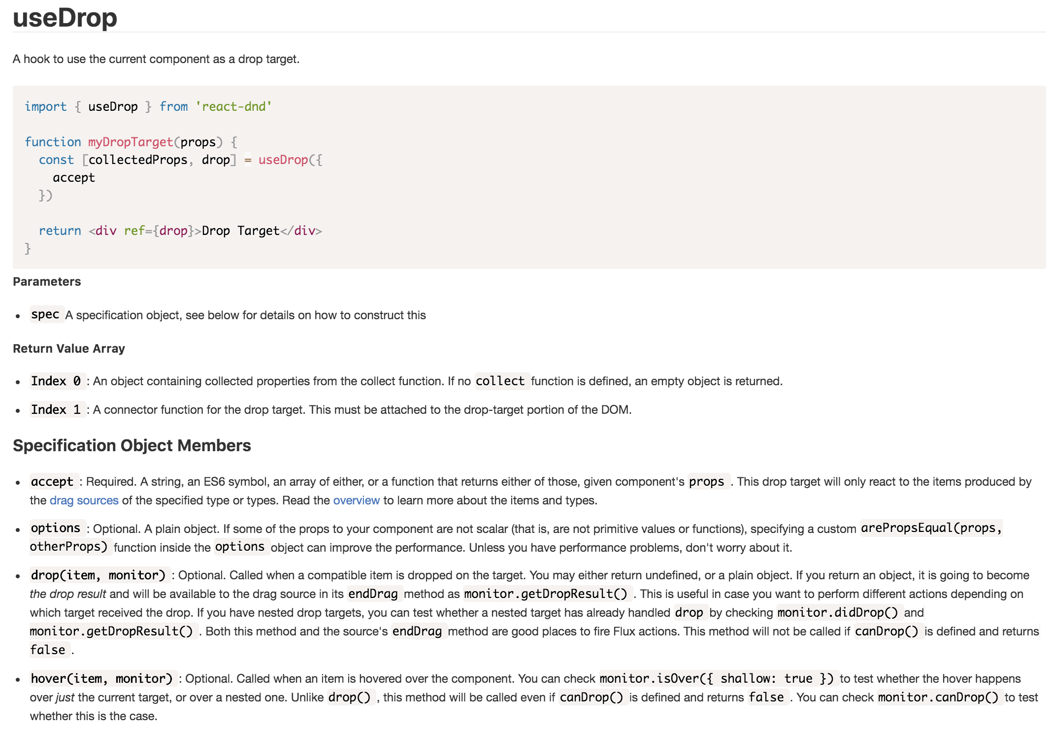
4.I used the hook useDrop to determine the drop target. This is the stationary component that helps in placing where the dragged element will be dropped. In addition, I used the hover method to detect when the element is being dragged. For reference, below is the React DnD documentation for useDrop.
const [{ isHovered }, drop] = useDrop({
  accept: dragDropTypes.TILE,
  collect: (monitor) => ({
    isHovered: monitor.isOver()
  }),
  drop(item: HoveredItem) {
    const { startingIndex, insertedCardId, insertedCardName } = item;
    if (startingIndex !== draggedIndex) {
      updatePosition(insertedCardId, insertedCardName, draggedIndex);
    }
  },

  hover: (item, monitor) => {
    // dragged element in the same place
    if (draggedIndex === item.startingIndex) {
      return;
    }
  }
)};
5.Declared a state variable to determine whether the indicator would appear on the left or right side of the tile
const [insertTileIndicator, setInsertTileIndicator] = useState(null);
6.Within the hover method I updated a variable insertCaretDirection to indicate which direction the placement indicator would appear. I set this variable to the state of insertTileIndicator.
hover: (item, monitor) => {
  if (draggedIndex === item.startingIndex) {
    return;
  }

  const isOver = monitor.isOver();

  const right = draggedIndex > item.startingIndex;
  const left = draggedIndex < item.startingIndex;

  let insertCaretDirection = '';

  if (left) {
    insertCaretDirection = 'left';
  }

  if (right) {
    insertCaretDirection = 'right';
  }

  if (isOver && insertCaretDirection) {
    setInsertTileIndicator(`select-${insertCaretDirection}`);
  } else {
    setInsertTileIndicator(null);
  }
}
The draggedIndex is the element being dragged and it’s being compared to it’s starting index. With the hover method I can detect whether the dragged element is being dragged horizontally left or right from the initial starting point.
7.In the tile component this is where I used classnames. By console logging the object isHovered I could tell exactly when the dragged element was being dragged. It was at this instant that I wanted to indicate in the UI where the tile dropped will be placed. Once isHovered returned true I assigned the state of insertTileIndicator to the tile element.
<div
  className={classnames(
    "tiles__item",
    `tiles__item--${displayWidth}-width`,
    { [`${insertTileIndicator}`]: isHovered },
    { dragging: isDragging }
  )}
  ref={previewRef}
>
8.Finally, in the CSS with the pseudo selecter ::after this is where I put the styling for the indicator. By using ::after I’m able to add cosmetic content on either the left or right side of the tiles.
@mixin insert-caret {
  background-color: purple;
  bottom: 0;
  content: '';
  position: absolute;
  top: 0;
  width: 3px;
}

&.select-left::after {
  @include insert-caret;
  left: -10px;
}

&.select-right::after {
  @include insert-caret;
  right: -10px;
}
In conclusion, it took a lot of console logging to determine when the dragging and dropping actually ocurred. It definitely helped to play around with the Sandbox examples for React DnD as well. Initially I was thinking I needed a custom drag layer, which overly complicated things. However, after rethinking through the logic it wasn’t the dragged element that I was adding the UI indicator to, but it was the element being hovered upon. In the end, this wasn’t required for the functionality of the feature, but definitely helps with user experience by indicting to the user where the tile would be dropping. After all, we’re trying to build the most user intuitive DAM platform!