At Brandfolder, we inject mobile design into our product by employing responsive, Progressive Web App methodologies. Recently I was coding a menu that needed to look different for mobile vs desktop viewing. Media-queries in my CSS were not enough to address this challenge because larger, tablet-sized screens needed the touch-friendly menu, while desktop screens with the same width as a tablet, did not.
Below, I walk through the solution I settled on, which involves:
- Use a server-side gem to determine the user’s device type based on the browser user agent in the request header
- Add a touchscreen-specific class to the page’s HTML
bodyelement - Target and style HTML almost anywhere in the app using the touchscreen-specific class.
Hopefully this solution can help you address a similar challenge or more generally some of these progressive web app issues:
- Custom styles (padding, menus, displays etc.) for mobile vs desktop devices
- Click vs hover functionality with mobile vs desktop devices
- Load smaller images or lower resolution videos for smaller screens and/or mobile devices to save valuable bandwidth
The Problem
Code a menu in a progressive web app that displays well for both desktop and touchscreen users: including narrow mobile screens and wide tablet screens.
The Solution
Before rendering the page, I add a class to the body element in the HTML that describes the type of device the user is browsing with. I found the Browser gem worked well for determining the device type based on the requesting browser’s user agent. Because the class is on the body element of the page, it can then be used for all sorts of design needs in the HTML that’s nested below the body, e.g. a responsive menu!
Adding this class to the body element as compared to adding it on the specific element I need to style is also a great way to ensure consistency across the entire app- there is one source of truth for the type of device the user is on.


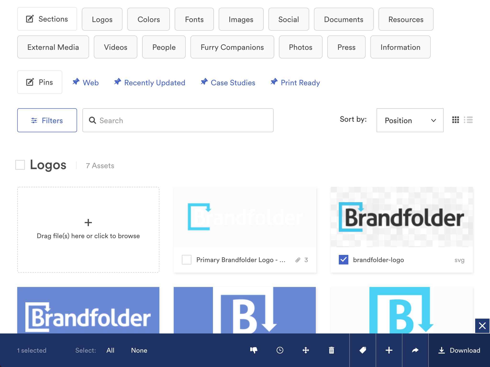
The two screenshots above show browser widths of 1024px. You get the blue menu on the left if you’re browsing from a desktop/laptop browser and the menu on the right from a mobile/tablet browser. The mobile/tablet menu provides more real estate for fat fingers versus the mouse-friendly desktop/laptop version.
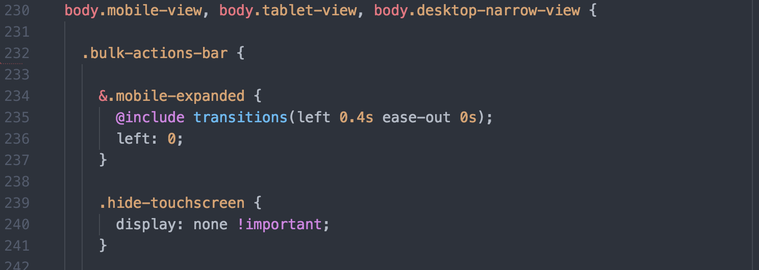
Styling the menu to appear differently at the same browser width would be challenging (impossible?) using CSS media queries alone. Determining the browser type server-side and attaching a class to the HTML body element allowed me to create CSS styling seen above.
The Stack
At Brandfolder, our stack consists of a Ruby on Rails app that sits on a PostgresQL database, driven by a Javascript frontend that uses React.JS and jQuery as well as ancillary supporting services written in GO and Python.
The Ruby
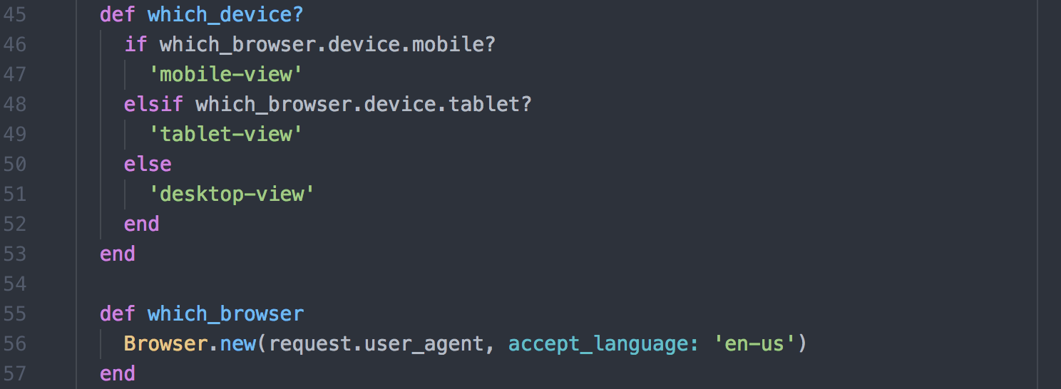
Below, I’m invoking the Browser gem with my which_browser method. This method returns an object with the gem’s best guess at the kind of device the user is on. The gem uses the user agent of the user’s browser to interpret the type of browser and infer from this, the type of device.

The HTML
Apply a mobile-view, tablet-view, or desktop-view class to the body element in the HTML by calling which_device?:

The CSS
With the view-specific class attached to the body element, we can now style to our hearts’ content, all in the same CSS file:

We still want to apply a lot of shared styling to all of the code. This is straightforward to do by adding all the different view-specific classes for this styling:

Other Solutions
Before implementing the solution above, I explored other ways to solve this problem: including server-side and client-side solutions, as well as feature detection. Ultimately the solution laid out above proved the most effective for our application as we were able to apply a server-side solution and we avoided potential screen flashes that might accompany feature detection via javascript. These docs provide a thorough and succinct summary of different options.
—
Holler with questions and critiques, especially if I missed something above and give a 👏 if you found this helpful!
